
This style guide provides examples of the application of FTC graphic elements and formatting of web materials. It addresses typography, colors, interactive states, and more. It was developed to ensure consistency in the look and feel of FTC.gov, and to provide visual cues and stylistic interest to online users.
- Colors and Branding
Logo, Primary Colors, Secondary Colors - Content
Icons, Button, Typefaces, Headings, Paragraph Styles, Pull-quotes, List Styles - Blocks
Accordions, Card Group, Graphic List, Ribbon CTA, Alerts, Embedded Submenu, Filters, Table, Pager, Breadcrumb - Media
Images, Video, Document, PDF - Search
Search Form, Search Results
Logo
Primary Colors
Secondary Colors
Social Icons
Font Awesome
Iconography for top tasks and take action links can be pulled from the Font Awesome icon library. Icons should be sized relative to the text it accompanies, roughly 25x25 pixels and in FTC Navy. Below are examples of icons used throughout the site. New icons may be downloaded from Font Awesome.
Button
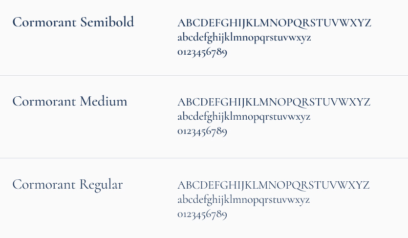
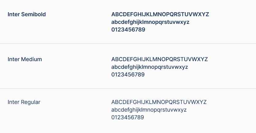
Typefaces
Cormorant is the primary typeface for headlines.
Inter is used for body text, navigation, and sidebar headings.
Headings
The page header is the title to your page. This is also referred to as Header 1 or H1. Because it is used as the title, there can only be one H1 per page. When titling your page it is important to accurately describe the pages’s content so that search engines can find your page. For this same reason we recommend never omitting an H1 on any given page. The Header 1 is: Cormorant Medium 48pt, with a line-height of 120% and a color of #1D3557.
Heading 2
The above title is created by selecting Heading 2 from the format dropdown in the WYSIWYG. The Header 2 is: Cormorant Semibold 32px, with a line-height of 123.5% and a color of #1D3557.
Heading 3
The above title is created by selecting Heading 3 from the format dropdown in the WYSIWYG. The Third Level Header is used to separate sub sections with a clear sense of hierarchy within a Sub Section. The Header 3 is: Cormorant Semibold 28px with a line-height of 115% and a color of #1D3557.
Heading 4
The above title is created by selecting Heading 4 from the format dropdown in the WYSIWYG. The Fourth Level Header provides yet another level to help break a page up into easily digested sections. The Header 4 is: Cormorant Semibold 22px with a line-height of 115% and a color of #1D3557.
Heading 5
The above title is created by selecting Heading 5 from the format dropdown in the WYSIWYG. The Fifth Level Header provides yet another level to help break a page up into easily digested sections. The Header 5 is: Cormorant Semibold 20px with a line-height of 115% and a color of #1D3557.
Paragraph Styles
This is the paragraph style, Inter Regular 17px, 33px line height. This sentence includes a default hyperlink style.
The intro paragraph style can be applied to a subtitle and is found in the WYSIWYG editor.
This callout block appears at the top of several pages. It’s set in Cormorant Semibold, 28 pt/38 pt, #1D3557. This block should include a short paragraph, roughly this length. Do not use this for a very lengthy paragraph.
Pull-Quote
This is a pullquote style. The pullquote is Cormorant Semibold, 30px, 137.5% line-height, #1D3557. Use this style to highlight a short quote. Do not use this style on a very long quote or multiple paragraphs.”
– This is the quote caption style. Inter regular 16/22.
List Styles
Ordered List
- Lacus lacinia aliquam
- Et felis et
- Cras dignissim auctor
- Amet lacinia sed
- Mi sit ipsum
- Cras dignissim auctor
- Amet lacinia sed
- Mi sit ipsum
Unordered List
- Lacus lacinia aliquam
- Et felis et
- Cras dignissim auctor
- Amet lacinia sed
- Mi sit ipsum
- Cras dignissim auctor
- Amet lacinia sed
- Mi sit ipsum
Unordered List with 'Icon List' style applied
Unordered List with 'Unstyled List' style applied
- Lacus lacinia aliquam
- Cras dignissim auctor
- Amet lacinia sed
- Mi sit ipsum
Unordered List with 'Unstyled List Columns' style applied
- Lacus lacinia aliquam
- Cras dignissim auctor
- Amet lacinia sed
- Mi sit ipsum
Accordions
Card Group
Lorem Ipsum

Eget porta lobortis lorem lacinia sed magna sed tempor enim lobortis est urna adipiscing neque felis nam convallis id lorem aliquam tincidunt urna dignissim.
Dolor Sit Amet
Magna vulputate iaculis consectetur et nam enim velit magna erat lorem dui venenatis ante vulputate nunc dictum dignissim aliquam.
Consectiteur
enim lobortis est urna adipiscing neque felis nam convallis id lorem aliquam tincidunt urna dign.
Graphic List
Magnaa morbi onec iam nulla ultricie.
Tur suscipit praesent lorem tortor diamin. Aliquama tortorp non anunc tique rissed sodale. Rissed egestas dolornu ellus teger posuere liquam massased. Tique diamin ulla at ullam orciduis faucibus aliquam potent.
Ellus facilis enim lum cras nequen
Cursus justov unc curabitu lacuse ulla. Teger gravida lacusnam proin pharetr rhoncus adipisci massama auris natis. Temporin imperdie at convalli cras cidunt non suscipit eger blandi.
Ribbon CTA
Sign up to get e-mail updates.
Alerts
Embedded Submenu
Filters
Table
| Vulputate dignissim vitae | Massa amet tempor | Sit amet viverra | Lacus egestas in | Fusce amet convallis |
|---|---|---|---|---|
| Ac malesuada et | Et nam auctor | Eu lacus magna | Consequat mi sed | Est tempor consectetur |
| Sit eros tempor | Tortor nam dignissim | Tincidunt duis convallis | Eros magna eget | Massa magna lobortis |
| Fusce convallis auctor | Erat lacus ut | Ac enim est | Et mattis lacinia | Sit sit erat |
| Urna sit dignissim | Nam sed elementum | Iaculis magna in | Mattis tincidunt enim | Lorem aliquam tempor |
| Elementum est nam | Nisl convallis in | Turpis tortor tortor | Amet auctor orci | In nec amet |
Pager
Breadcrumb
Images


Video
Document
Search Form
Search Results
Frauds, Scams, and COVID-19: How Con Artists Have Targeted Older Americans During the Pandemic
Panel: Top Scams Affecting People in MA
Online Investment Site to Pay More Than $2.4 Million for Bogus Stock Earnings Claims and Hard-to-Cancel Subscription Charges
Coronavirus (COVID-19) Pandemic: The FTC in Action